If you follow my blog closely, you’ll probably notice that my most active posting periods are when I’m home in New York, mostly holidays and summers. As such, you may have been expecting a break in my radio silence, and here it finally is.
I went to the Met on my first full day home (Sunday). There is much to see there (what else is new), and I may go back, but there were two shows in particular I wanted to catch before they closed: Faking It: Manipulated Photography Before Photoshop (this had taken on new importance for me as I am beginning research on surrealist photography for a possible exhibition), and Regarding Warhol: Sixty Artists, Fifty Years. I’m not sure I have much to say about the former – I will think on it and post separately about it if I do – but I have much to say about the latter.
I will start by disclosing that my expectations of the Warhol show were measured by negative responses I’d heard. Some thought it was completely expected, with no surprises, which I can easily understand. The show is about Warhol’s influence on the art that has come since. This is by no means an under-discussed topic–it is, in fact, rather obvious, which makes it all the stranger that there hadn’t yet been an exhibition about it.
The other criticism I heard, second or third hand, was that there wasn’t enough Warhol in it; since I thought there was plenty Warhol alongside his descendents, this sounds like a complaint from someone who perhaps doesn’t realize that the show is not meant to be primarily about Warhol.
In fact, the show may have been used as an excuse to show some Warhol pieces, even if their specific influence was not demonstrated. One example was a room with his helium-filled silver mylar clouds, which visitors could tap and push around. It’s hard at any age not to be enchanted by such an interactive experience, and I thoroughly enjoyed it. But there was no other corresponding interactive installation from a later artist that might have demonstrated that Warhol was an early executor of a now frequent art practice (though not interactive, in its intimate enjoyment and focus upward it reminded me of the rainbow room in the Dale Chihuly exhibition at the MFA Boston in Summer 2011). The only causal link between this room and other work in the show was its neon cow wallpaper, which corresponded with an installation of Takashi Murakami happy-face daisies.

Warhol’s silver clouds and cow wallpaper at the Metropolitan Museum of Art

Daly Chihuly at the MFA, Boston, Summer 2011

Takashi Murakami in “Regarding Warhol” at the Met
But I digress. I would say my main critique of the show was that it did not cohere into more than the sum of its parts. Despite the themes it attempted to organize itself by, there was not a shape or a story or a rhythm to it. You started, went along through looking at what was on display, until there was no more work to see and it ended (as always, but more jarringly because it’s just too perfect, with a gift shop). There was no particular logic to the progression or the endpoint.
My mother’s complaint was that, compared to Warhol, the artists that came after were completely uninteresting. At first I disagreed (we generally have differing opinions on the art that has come since). And yet, when I said I enjoyed seeing what was in the show, and was asked what that included, the only works I could remember were Warhol’s; they did seem to make a more lasting impression, which may indeed speak to their higher quality and impact, thereby reinforcing his importance–as this show is meant to demonstrate.
For example, at first I tended to gloss over the expected colorized portraits of celebrities – Mao Zedong, Jacqueline Kennedy – their over-reproduction on tote bags, etc., making me presume that they had nothing new to show. But on closer inspection, they are more painterly than I expected; this is not the Factory Warhol, but one whose child-like play with color and brushstroke over silkscreen display artistry that counteract his consciously constructed, and often too accepted, claim that he was a machine.
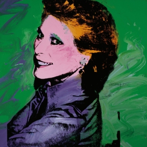
Andy Warhol, Nan Kemper, 1973, acrylic and silkscreen on canvas
Another just stellar, and unexpected, portrait was one of Jean-Michel Basquiat. This was exhibited as part of the theme, “Queer Studies, Shifting Identities,” which I thought was an important inclusion (and a seeming continuation of Warhol’s prominence in Hide/Seek: Difference and Desire in American Portraiture), given that “Warhol’s importance as an artist who broke new ground in representing issues of sexuality and gender in the post-war period” has often been overlooked.
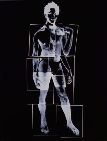
Andy Warhol, Jean-Michel Basquiat, 1984, Acrylic and silkscreen on canvas
Seeing the Brillo Boxes made me realize that I wasn’t sure I’d ever seen them in person before. They’re far more ragged, aged, and imperfect than reproductions would have you expect (my mother the conservator points out that that’s true of all art, Old Master paintings included). They oddly had 4 in a straight row, all from one collection, some more yellowed than others, and then one more from a private collection, set off at an angle, and contained in plexi as its owners must’ve stipulated – why include this odd-one-out?


After stressing that this was a show about Warhol’s influences on others, I of course have thus far only talked about Warhol works–again, they were the most memorable. Most numerous in representation after AW was, unsurprisingly, Jeff Koons, with major works from each of his most famous series. This brings up an important issue that this show did not attempt to tackle, difficult though it may be: whether artists like Warhol or Koons who exploit popular imagery and the mechanisms of the marketplace are complicit in the commercialism which they may, or may not, be critiquing. Is there a difference between the two, both of whom eventually mass-produced their own works seemingly only for the sake of profit? Since Warhol did this first, is his a more important conceptual gesture, whereas Koons is just a sell-out? Is Murakami, with his for-profit corporate arm and his Louis Vuitton bags conversely less culpable, because his commercialism is so out in the open it must be tongue-in-cheek? Perhaps this is such a rabbit-hole question it deserves its very own show – or multi-volume book.
In the museum’s description of the section of the exhibition that might have treated this issue, curators white-wash it with the rather separate issues of collaboration and spectacle:
“No Boundaries: Business, Collaboration, and Spectacle”—the final section of the exhibition—examines Warhol’s interest in artistic partnership through filmmaking, magazine publishing, music, and design. Also foregrounded is his fascination with creating environments that envelop the viewer entirely. Warhol’s frequent use of decorative motifs, such as flowers, are part of this practice, and are contrasted with similar work by artists such as Jeff Koons and Takashi Murakami.
For a show on a topic so long overdue for its own exhibition, Regarding Warhol was a missed opportunity, an accumulation of things rather than what should have been an articulated and possibly quite provocative argument.
I hopefully shall be writing soon on Picasso: Black and White at the Guggenheim (or as it was recently and amusingly autocorrected, the googly mogul).